Back
Hardspace: Shipbreaker
Hardspace: Shipbreaker is a space sim where players salvage derelict spacecraft in zero-gravity. Working for Lynx corporation in a dystopian future, players dismantle ships to extract valuable materials. Each vessel presents unique challenges, from hazardous materials to complex interiors. The game combines physics-based puzzles with a narrative exploring corporate exploitation and labor issues in space.
My Role: UX Designer, UI Tech Designer
Sign the Contract (Player Landing Screen)
My responsibilities began with designing the main menu, which players encounter immediately after the opening cinematic and agreeing to the policies. In the Lynx Corporation's dystopian setting, players—as contracted workers (”cutters”) —must "sign their lives away," clone after clone. We presented them with a contract, then guided them to the profile selection screen. Each profile represents a signed contract, maintaining the narrative's immersion.

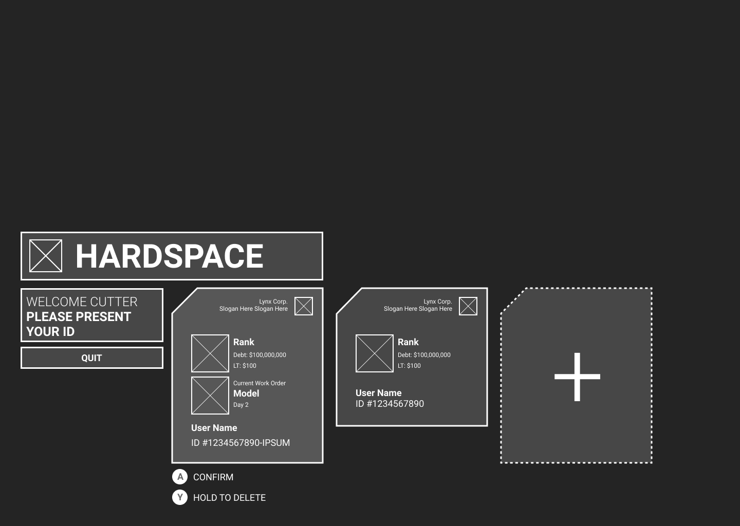
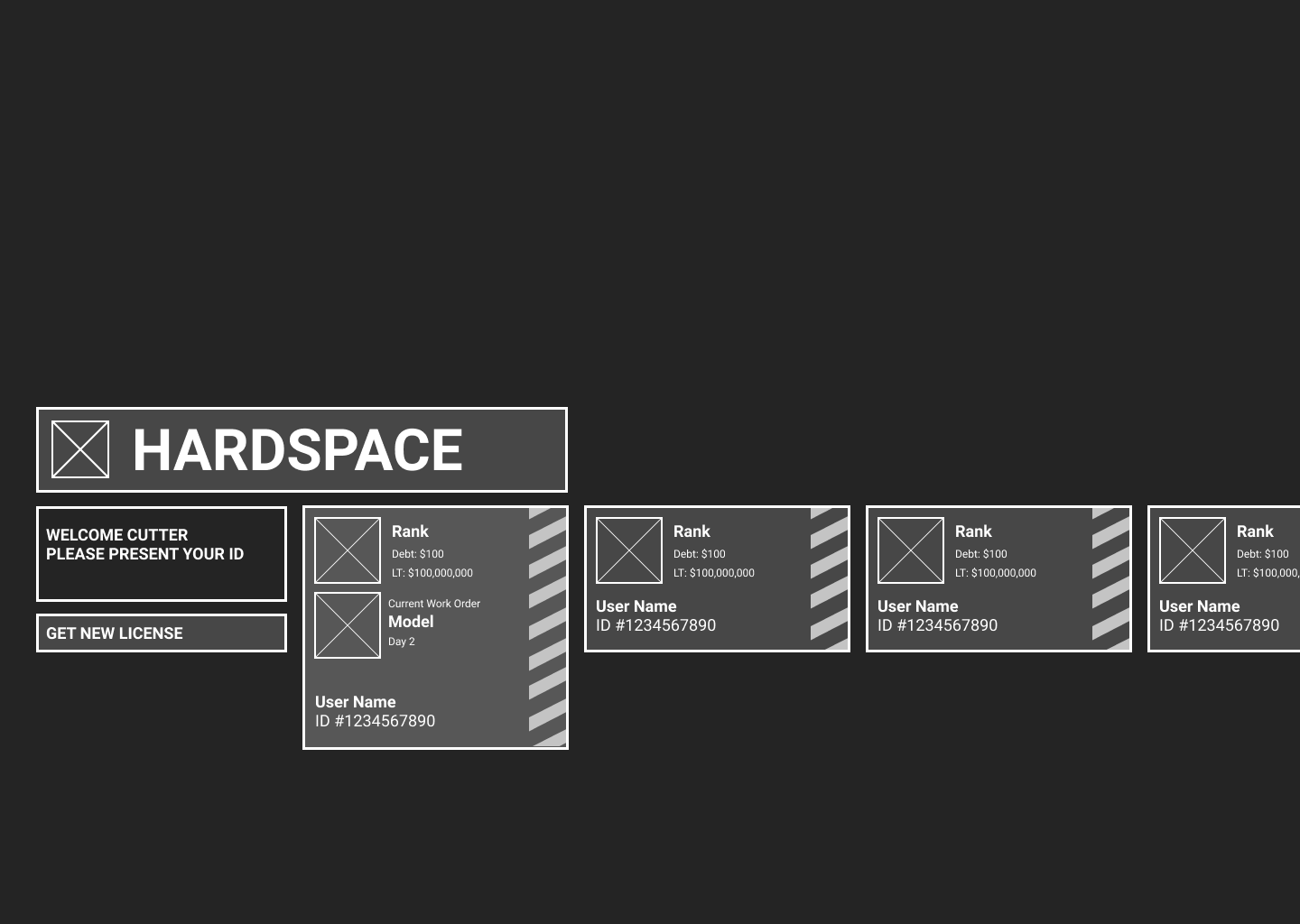
User profiles (”Contracts”) in various styles
Settings Panel
The Settings Panel is designed in the same language as the in-game console OS.


UX Heuristic Check & UI Optimization
Since the team did not have a dedicated UX / Tech UX Designer before I joined, I conducted a screen-by-screen heuristic check for the game.
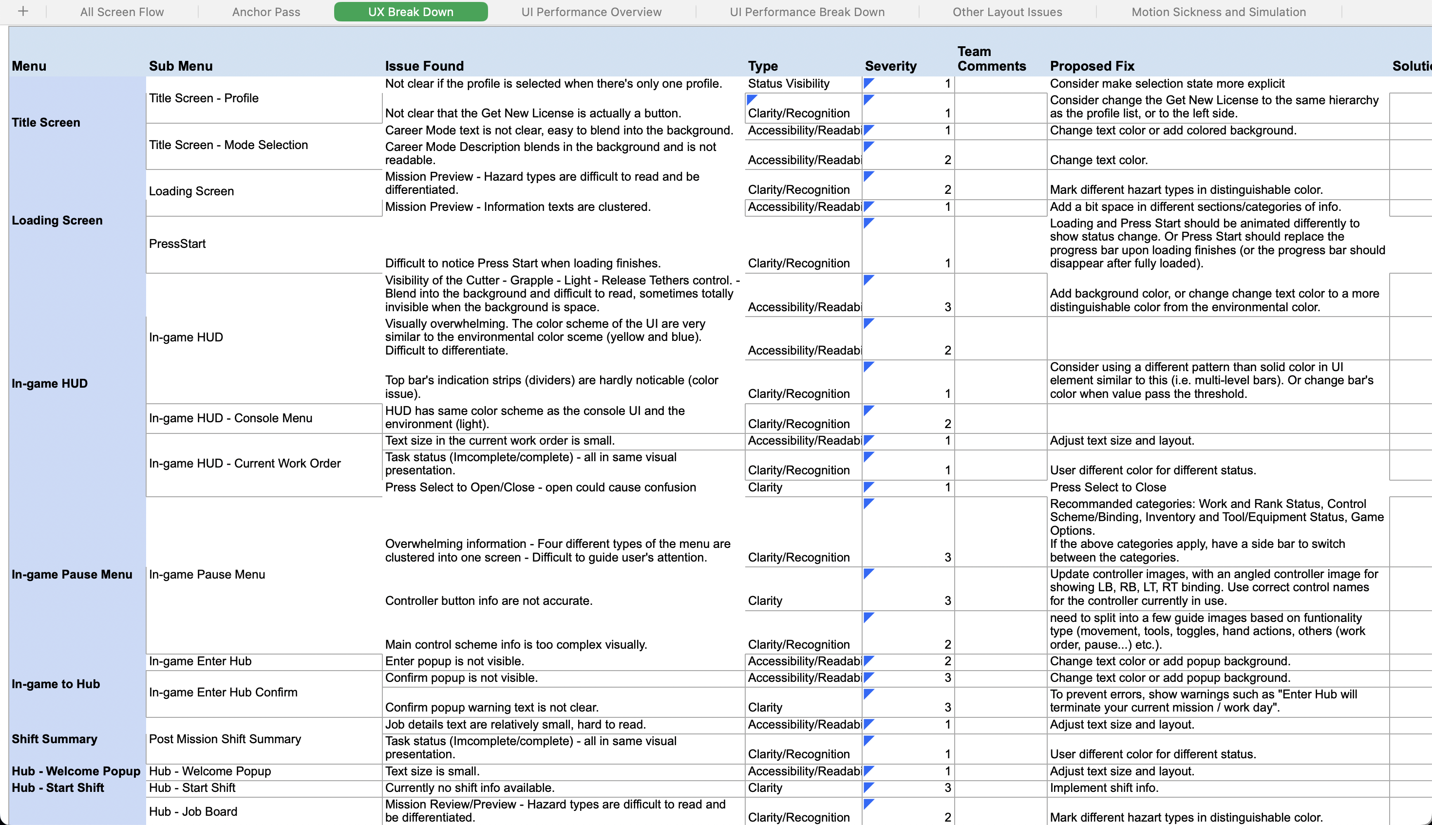
Following the user-centered design principles and internal usability tests, I marked all UI components that were lacking clarity, consistency and feedback, then consolidated all UX issue found based on usability heuristics in a list for better tracking. Proposal of fix is provided to each item. We were able to tackle most of the issues before the early access release of the game.
UX Flow Checklist

UX Issues Break Down
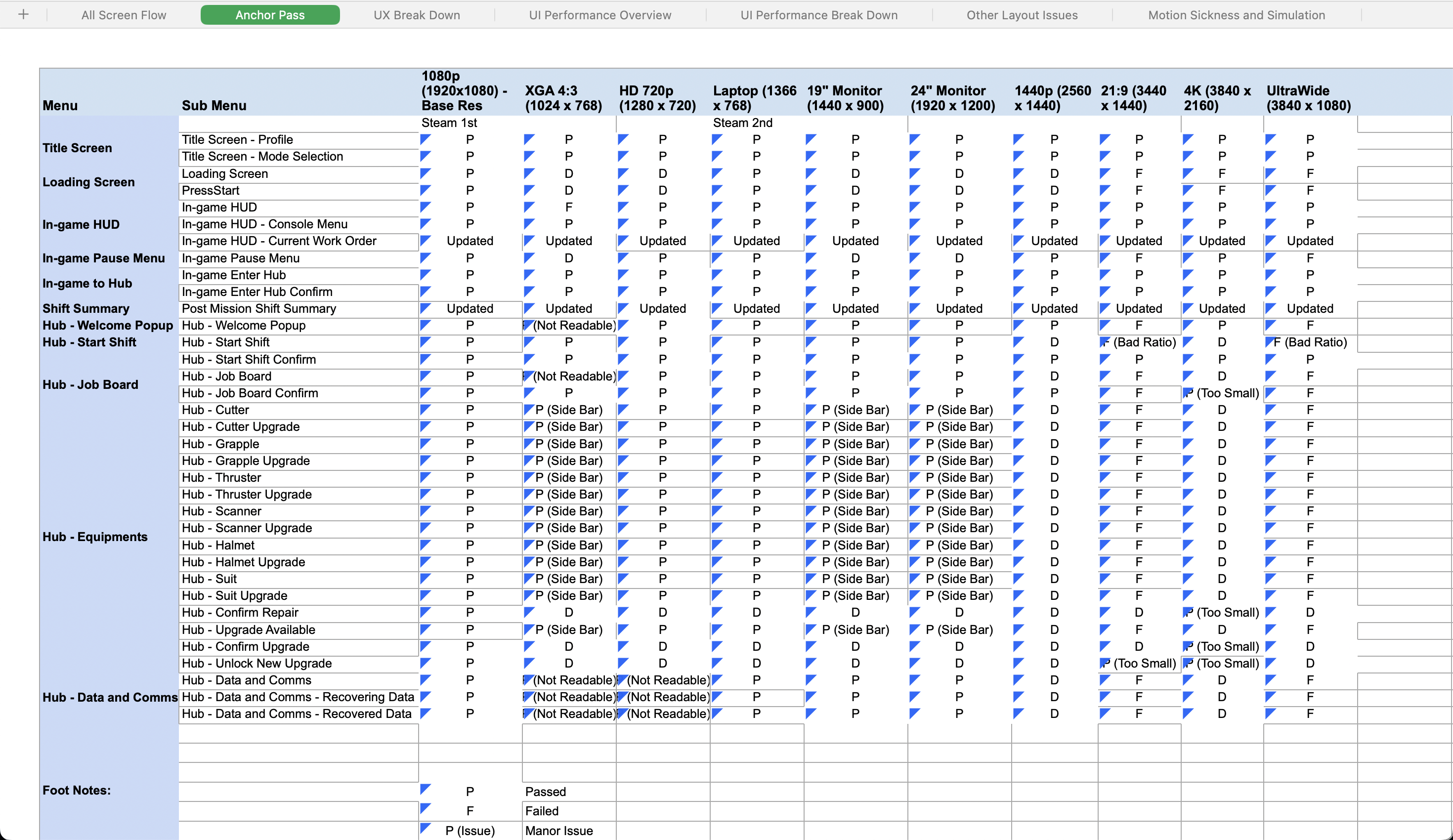
UI Implementation Checklist for Resolution Adaption
I have also ran a resolution check for the game, which was lacking before I joined the team. First releasing on Steam for PC then consoles, I performed a resolution pass based off steam’s official user data of display settings. Then I implemented the UI adaption fix in engine (Unity) screen-by-screen.
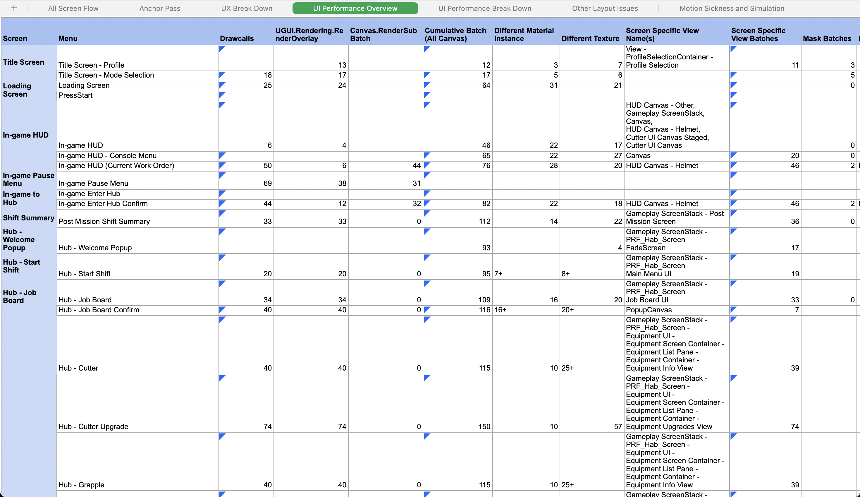
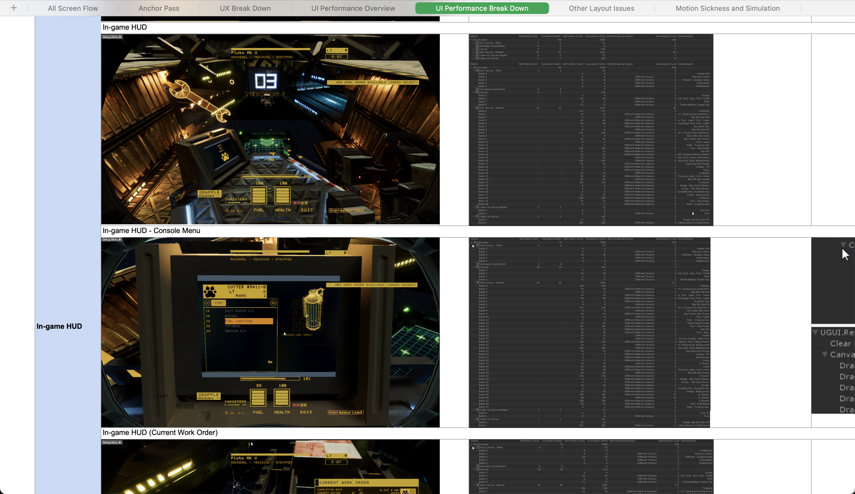
UI Performance Overview (Drawcalls and Batching)
It was also crucial for our game to run smoothly, given it’s a first-person-perspective simulator-like game that will require consistent mid-high framerate to run, for the players to enjoy and immerse in the experience.
Since the 3D simulation graphic already takes a lot of resources to run smoothly, what I could offer is to optimize the UI as much as possible, with visual and animation preserved high-quality.
I performed a drawcall pass for UI screen-by-screen, then fixed all the batching issues, z-axis inconsistency and reduced drawcalls significantly.
Accessibility - Motion Sickness Study
When I play through the game, I experienced nausea very often at the beginning. Even though it was a issue that would relieve on its own through more play time, it was not as pleasant for many people who experiences nausea easily as me, but still wanting to enjoy this game given its satisfying mechanic and beautiful graphics.
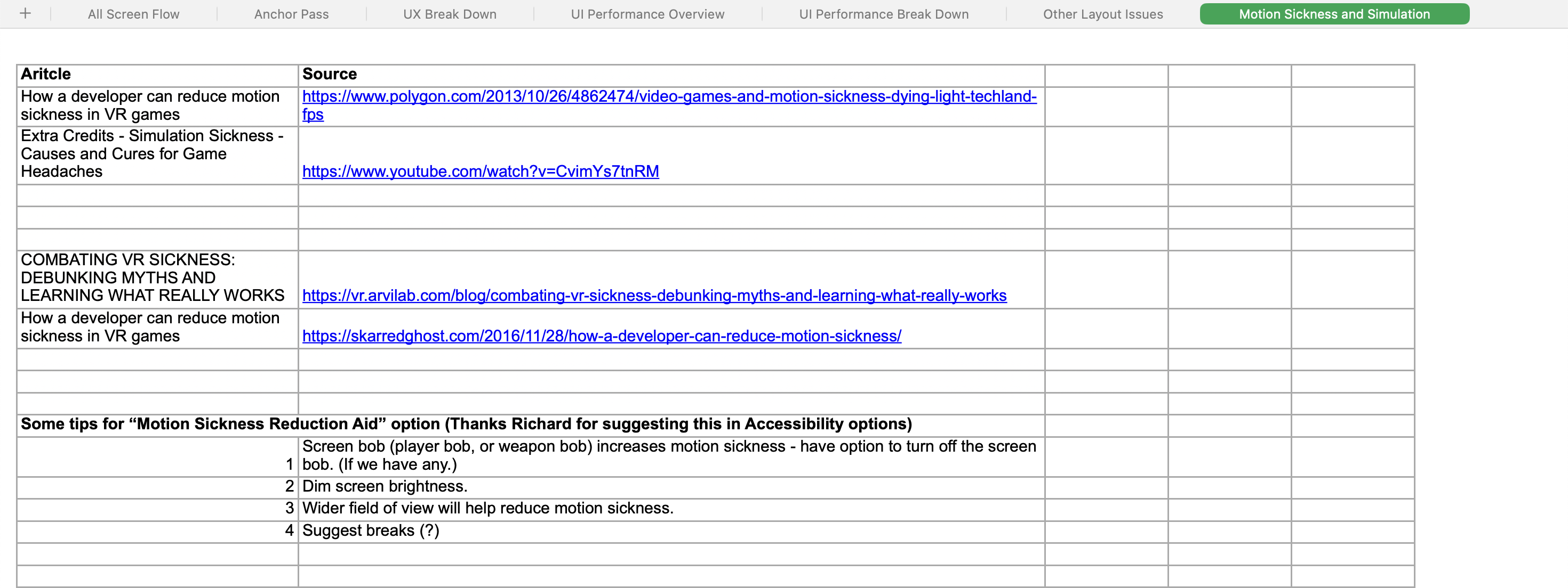
I conducted some research in reducing motion sickness in FPS games, and proposed a few solutions that might ease players’ discomfort playing a FPS game in zero-g, including tunnelling during movement and improve accuracy of center-pointer snapping.
