Back
Earthless - UI/UX 0-1
How do we distinguish ourselves from the swarming rogue-like deckbuilders? 🤔
- Our sauce: Deckbuilder x Tactical Gameplay, with outstanding visual and unique diegetic UI.
Imagine Slay the Spire x Xcom, in space. Early 2020, Hoi-Fung Ma, Maher Manobi and I pitched a game concept together to our studio, Blackbird Interactive Inc..
With a paper prototype and a single-level digital prototype, the project attracted wide publisher interests at the GDC 2020 private sessions, which led to an green-lit production.

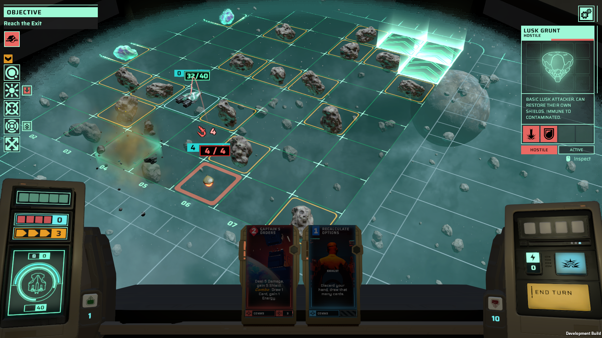
Game screenshot for Steam Next Fest, 2023
EARTHLESS is a rogue-like deck builder with tactical gameplay, set in a sci-fi retrofuturistic style.
My Role: Lead UI/UX Designer + Tech UI Designer
Project Span: 2020 - 2024 (Early Access)
Key Differentiators: Tactical Gameplay x Deckbuilder, Retrofuturism, Diegetic UI
Tools I Used: Figma, Unity, Illustrator, Photoshop, Miro
Competitors - What’s Done Right? What’s Done Wrong?
i.e. XCOM, Into the Breach, Slay the Spire, Monster Train, and one of my favourites, Fire Emblem… and our direct competitors such as Breachway and Alina of the Arena…etc.
We want to attract audiences from all of the above - people who enjoy strategic and replay-able gameplay, and those who appreciate sci-fi and space, which are core to the studio.
By collecting user feedback and analyzing their user experiences against core heuristics, I was able to prevent many potential errors throughout our production.

Combining our core gameplay, I provided an in-game screen layout which we soon tested in the greybox prototype made in the engine.
Designing a Complex System 🎮
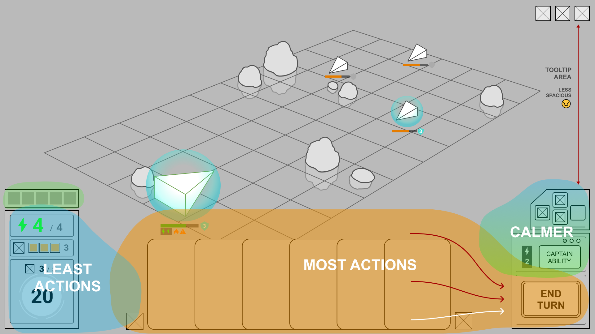
First, I focused on the most essential system: the in-game interfaces, designed in three layers.
- The “grid” - the holographic battlefield for tactical gameplay.
- The “Captain’s Console” - where the player (as the captain) keeps track of ship status and plays cards (by issuing “commands”, fictionally).
- The HUD - taking place at the upper half of the screen containing additional information, visible when needed (by hovering / toggling).
Then, I move on to the UX design of each sub-system of the game play.
An example of In-Game Sub Systems - a Preview System:
As a deckbuilder and tactical game, keeping the player informed of gamestat changes at all times is crucial.
It is equally important not to overwhelm them. Therefore, much of the information we provide to assist the player's strategizing is through graphical presentations, to accelerate the player’s gameplay.
For example, we provide the player with a preview system through on-grid feedback to indicate the consequences of player’s next action:
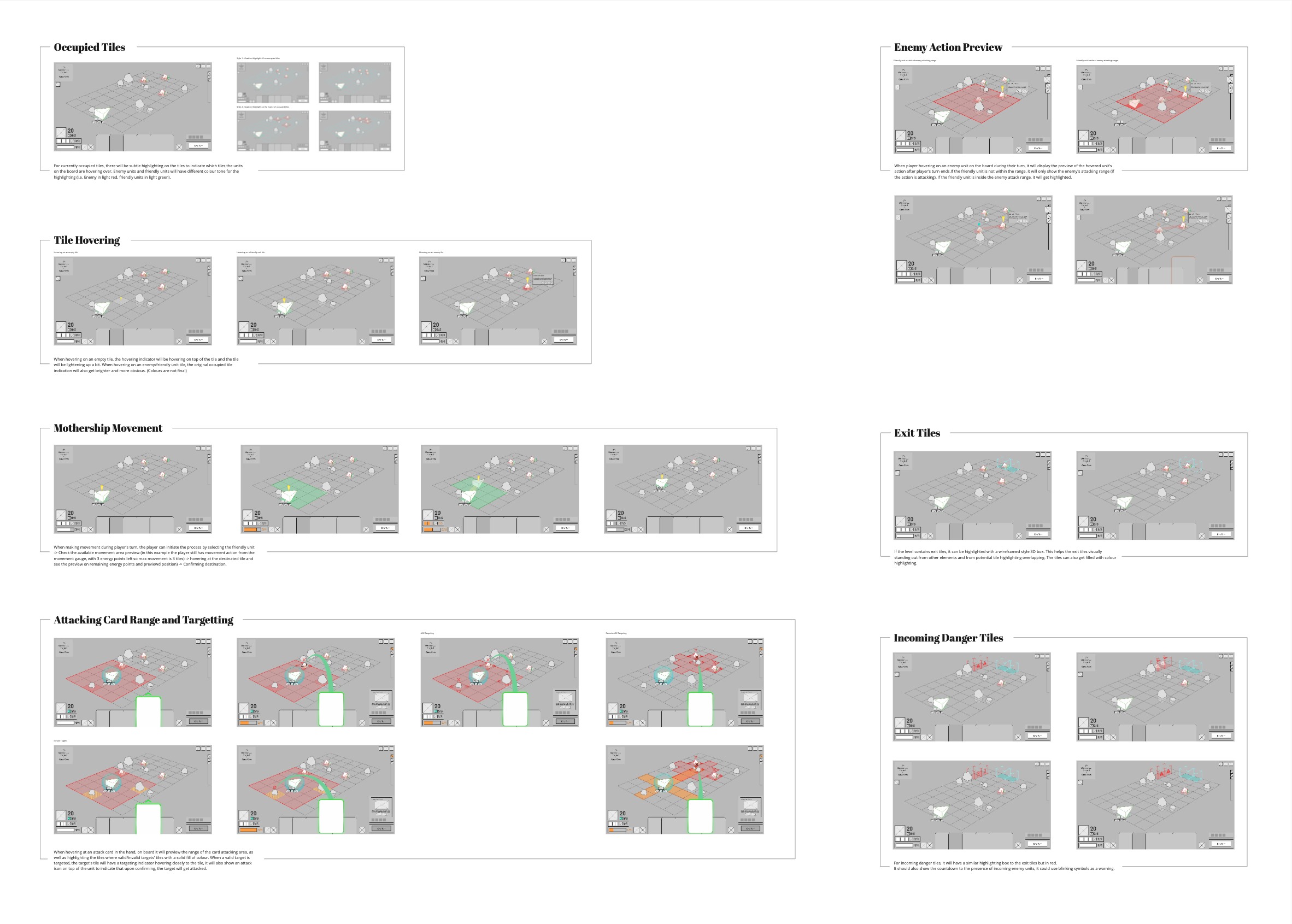
Here’s a visualization of the grid feedback and preview system in the game, using the ship movement as an example:
Ship movement and preview system
Overall Game Flow for Roguelike Gameplay:
After I finished the first-version wireframes of the in-game features, including encounters, roguelike events and passive upgrading systems, I moved on to out-game features and metagame features.
In Figma, I created an interactive prototype of the whole gameflow in wireframes. This is used to effectively showcase features to executives and directors to accelerate design decision making, as well as to the team for clear communication.
Each major feature has an interactive prototype of the UX flow built in the Figma project, which helped us to test early and prevent errors in feature implementation.
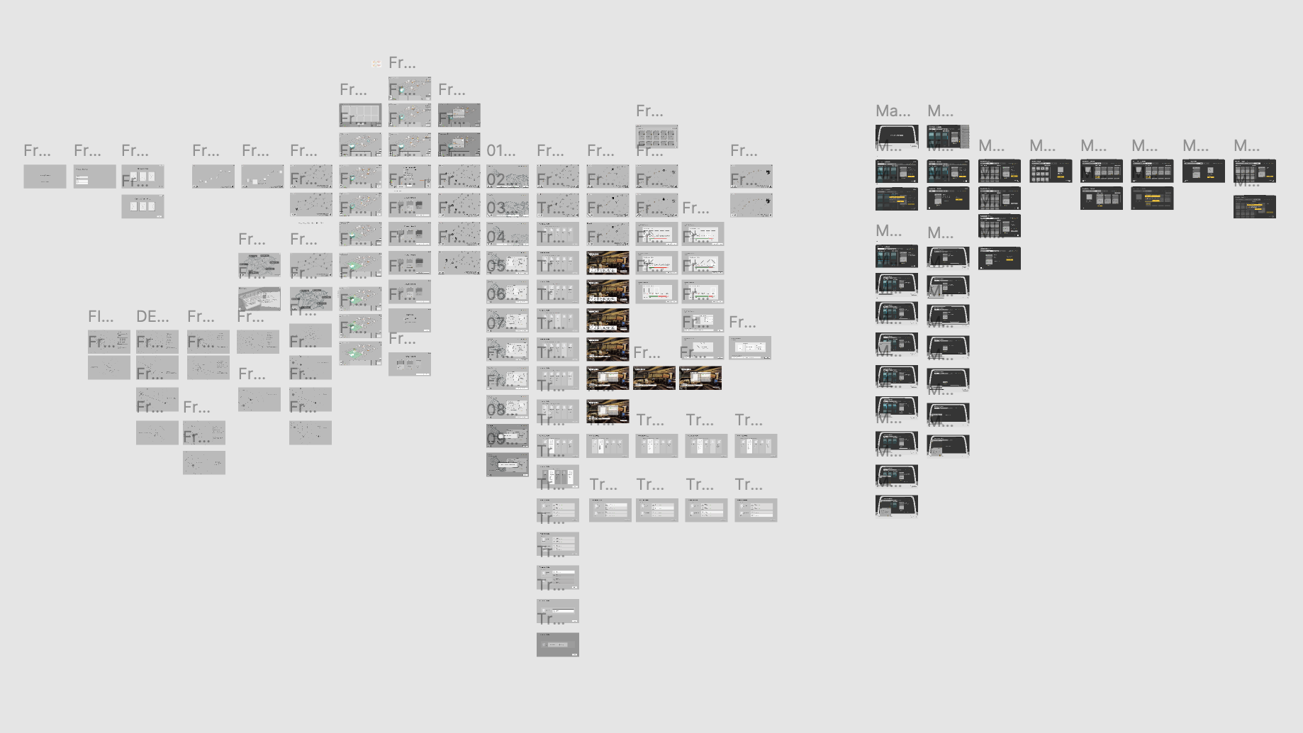
Interactive prototype of early game flow in Figma
Non-conventional UI 📺
We had a team with incredibly talented concept artists, 3D artists, and an exceptional UI artist. Now, how do we take the advantage of their expertise and make the game UI stand out from our predecessors and competitors?
The answer is simple: our UI should be part of the game’s world, harmonizing with the game’s world building in the same aethestic.
Early on, we decided to build our game with Diegetic UI, which is not commonly used in the card game genre, to fulfill the player's captain fantasy commanding a space battleship.

Diegetic UI:
By presenting the advantages of diegetic UI, we moved forward with the composition of our main interfaces as the combination of the “Captain’s Console” and the “Holotable” as described earlier.
Where the two interfaces providing the key functions of game-play in-game:
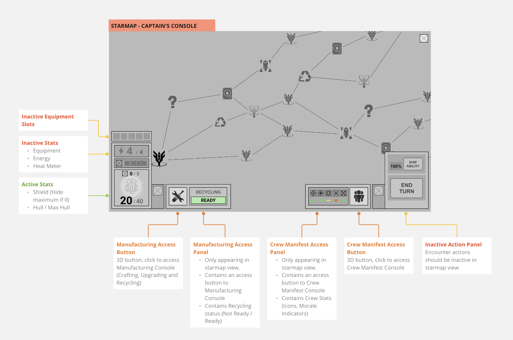
and providing the rogue-like map (starmap) and out-game feature status and access:
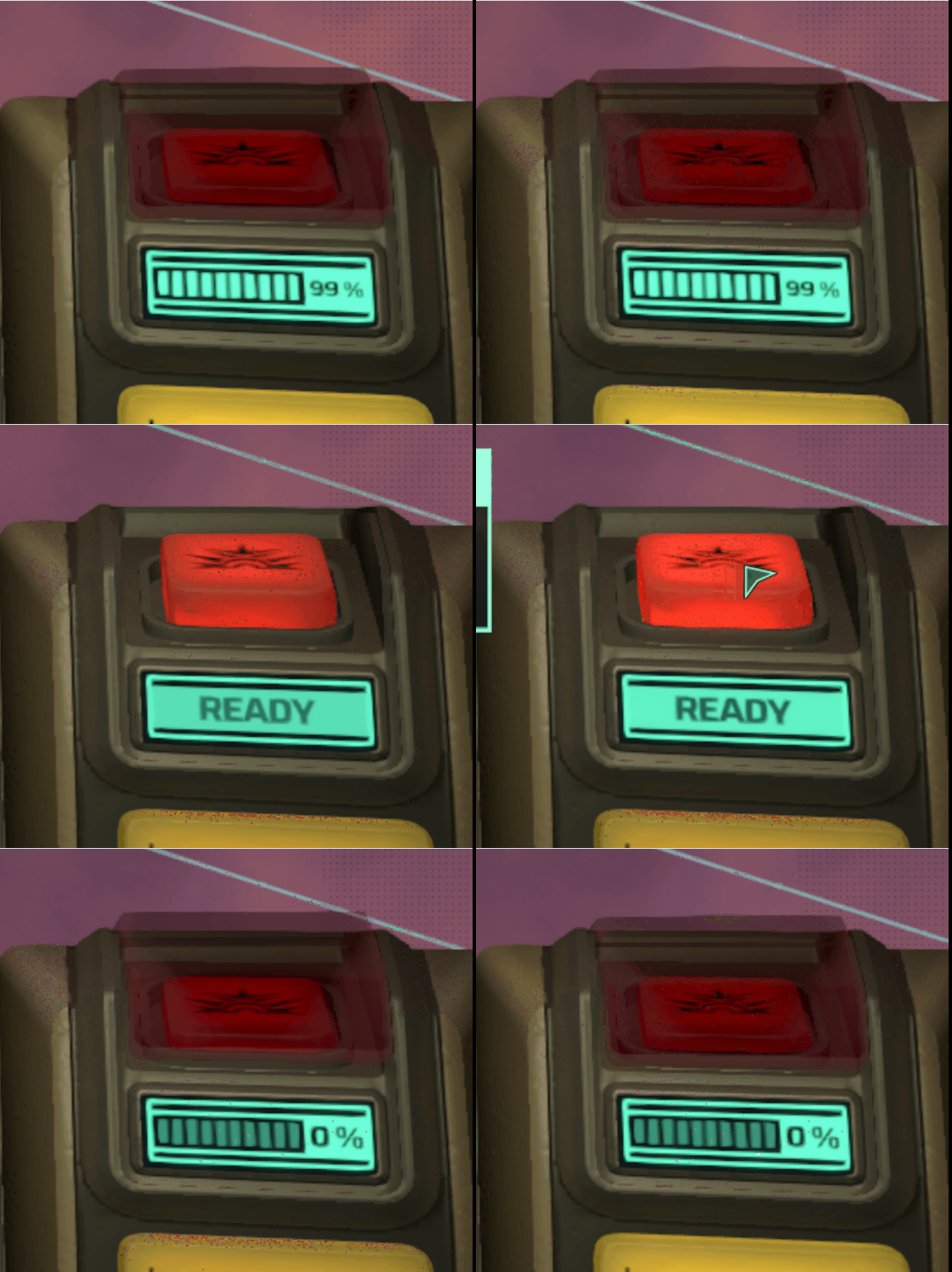
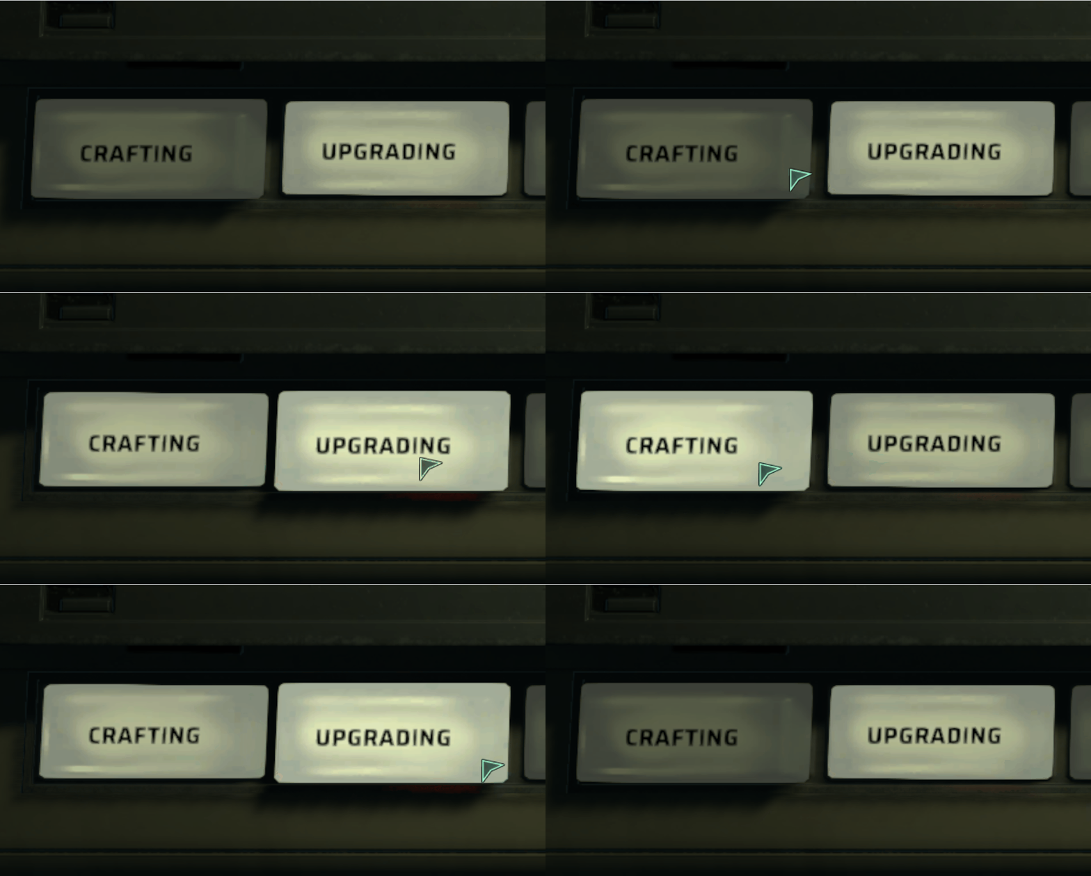
Lively Feedback: Emission for hover states, pushing down for real-life reassembling. All for intuitive and satisfying interactions.
We also ran into debates of out-game feature designs such as the following:
This was definitely one of the most interesting problems I solved, creatively.
- Previously, our metagame features such as crafting, upgrading and crew manifest were displayed on side consoles (imagine one macintosh with 2D UI displayed on the screen).
- However, we ran into two groups of opinions in the team:
Artists:
Side consoles were just screens mounted both side of the captain’s pedestals, looking like big iPads. We should remove them and have holographic 2D UI overlays for outgame features instead.
Me:
Great point, instead of removing them, we should consider more options that are:
- Providing immersion and enhancing our narrative, and
- Diegetic All-the-Way (Consistency)
So here’s my solution:
- Be loyal to our retro-futuristic aesthetic, meanwhile, make it actually functional.
- Make “physical” buttons and cartridges that are satisfying to click on and fun to observe, to attract users to out-game and metagame features.
- 3D cards and buttons are in-game, thus should also be present in out-game as-is to provide consistency.
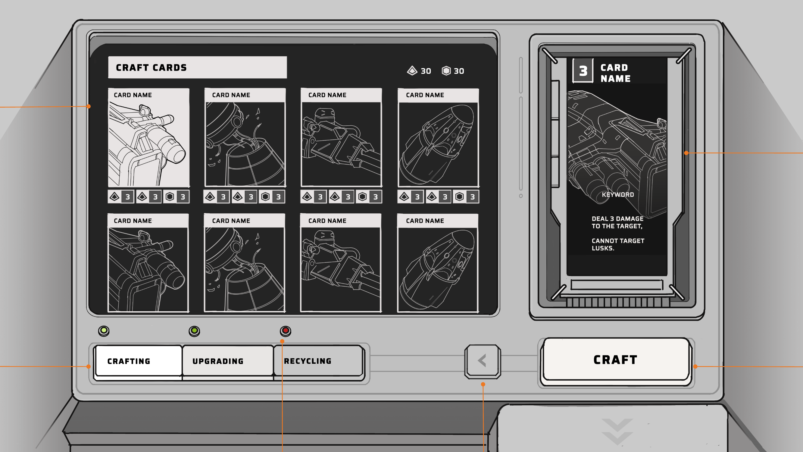
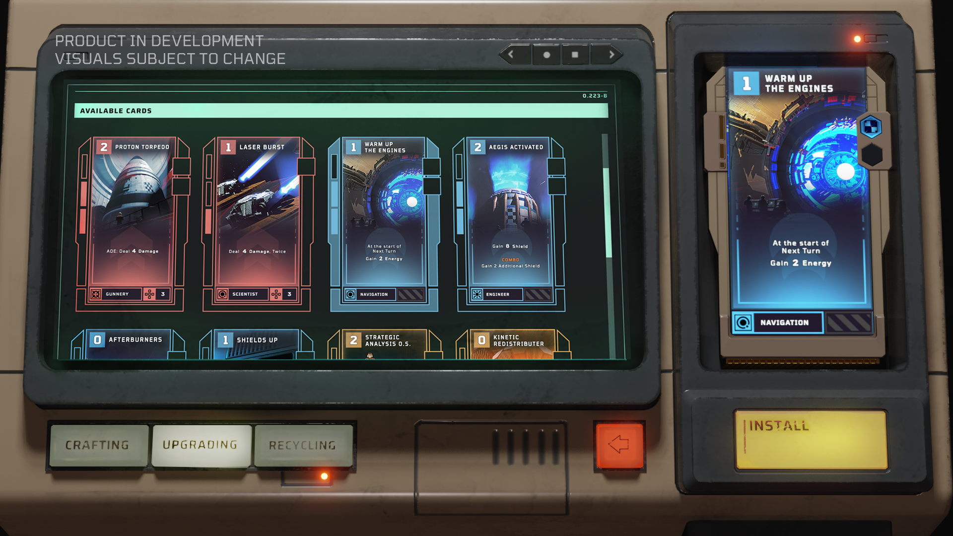
Here’s the breakdown for Crafting, Upgrading and Recycling, each utilizing the CRT screen, 3D buttons and the 3D cartridge from the same “console”:

Utilizing Figma’s interactive prototype to visualize target user flow also helped me to present ideas and communicate with the team effectively. For example - this is how I designed to guide player’s attention for self-explanatory artifact installing function:
.png)
Upgrading / Recycling console
Creative Narrative UI:
Working with the narrative designer, we iterated the narrative events of the game a few times. Wen want to further reinforce the Captain Fantasy by building a stronger connection between the player (the captain) and the crew.
Thus, instead of monologues delivered solely by AI in early iterations, we decided to present the event through crew’s communication in a chat-room-like setup:
Ship Events - carried out in crew communication room
All these diegetic design helped us to speak our aesthetic, assist user interaction and stand out in the Steam store.
Iterated, Fast 🏗️
With all the wireframe prototypes, we can fail fast to iterate fast, and sometimes we…
Fake it til’ Make it
When we decided to integrate an “Entrance Console” to make the transition from the main menu to the gameplay fitting the worldbuilding, I first implemented the console by reusing 2D concept assets:
Implementing the entrance console with 2D assets before switching to 3D (See FTUE section)
Which proved the concept and readied it for milestone’s testing, followed by the production of the 3D assets with reassurance of positive feedback.
Accelarating Feature Completion with Strike Teams
In the final year of production, we hit key milestones: Media exposure, Gamescom demo, and Steam Next Fest build. The game rapidly evolved, debuting at Steam Next Fest 2023 and garnering 20k wishlists, topping the Steam leaderboard.
Our success stemmed from efficient strike teams. For each milestone, we formed 4 teams, each tackling two or more major features within a 6-week timeline.
I spearheaded 1-2 strike teams per milestone, collaborating with artists and engineers to streamline communication and accelerate development. We used Miro to keep track of the progress.

Prioritizing the strike team features and goals

Legends for strike team prioritizing & tasking
FTUE x Narrative
Here’s Your Crew, Captain
We designed the First-time User Experience (FTUE) combined with our narrative design - to present the player their ship of choices, crew members on a console, followed by an animated transition to the bridge and the captain’s pedestal where the main gameplay happens.
This would smoothly connect the metagame and in-game experiences in the same game space with full
immersion.
.jpg)
Flow of First-Run with FTUE vs. Regular Runs
Ship and crew introduction
Metagame - in-game Transition
Compatibility and Control 🎮
Our target platform is PC and Switch, where we are actively adapting a natural feeling control scheme.

What Do People Think? 🗒️
Playtests
With the limitation of testing opportunities, we were still able to conduct playtests in various forms, in-house or externally with the help of our publisher.
Feature playtest in wireframes using Figma
After implementing a feature flow as an interactive prototype, I would gather feedback by having people navigate through the feature with minimal instructions. This approach helped us validate features early in each milestone’s development process.
In-house playtests with milestone builds
We conducted in-house playtests on several milestone builds. Our data analyst collected and analyzed the results, which we then recorded and prioritized for solution implementation. We also extended our playtests to friends and family. Notably, we observed an 8-year-old player play through the game without obstacles, which boosted our confidence in the game's accessibility.
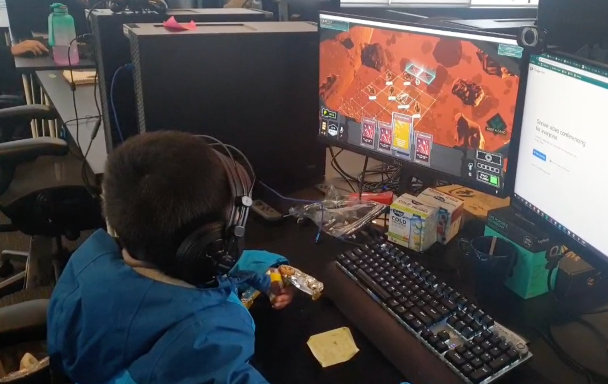
External playtests through the publisher
Our publisher's user research team conducted several playtests with recruited external players, while we were observing. These insights helped us improve controls and implement a FTUE tailored for players with varying levels of familiarity with the genre.
Media and Community Feedback
We received major game media’s feedback during the Gamescom and Steam Next Fest 2023. The media recognized the innovative strategy, engaging tactical combat and compelling atmostphere of Earthless, which encouraged us to polish the game further.
 https://www.rockpapershotgun.com/earthless-is-a-homeworld-cardgame-and-a-pretty-good-time
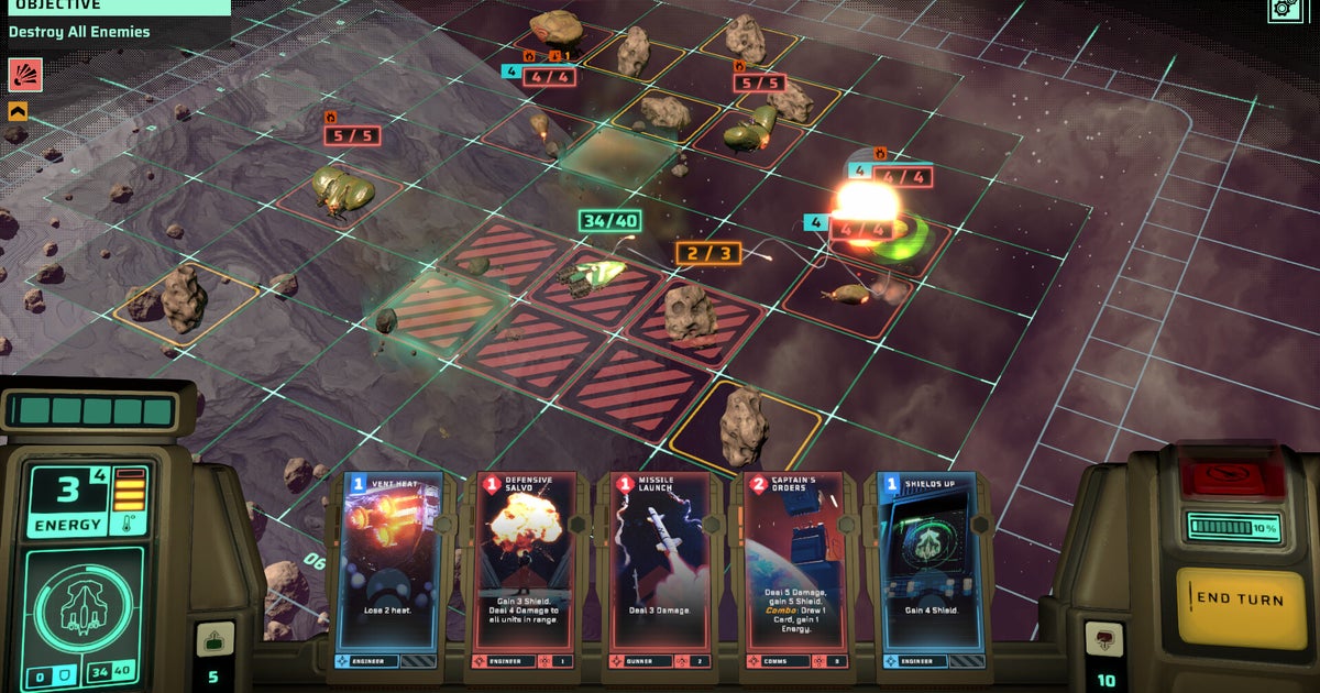
 https://www.pcgamer.com/earthless-is-a-new-sci-fi-deck-builder-from-the-creators-of-homeworld-3-where-youll-need-to-come-up-with-ludicrous-game-breaking-combos-and-win-over-your-crew-to-have-a-chance-at-saving-humanity/
 https://www.techradar.com/gaming/pc-gaming/earthless-preview-a-mass-of-systems-combine-for-a-compelling-sci-fi-card-game
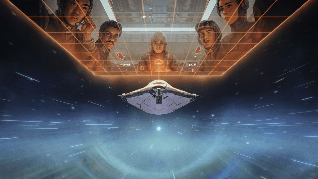
Tech UI Implementation in Engine
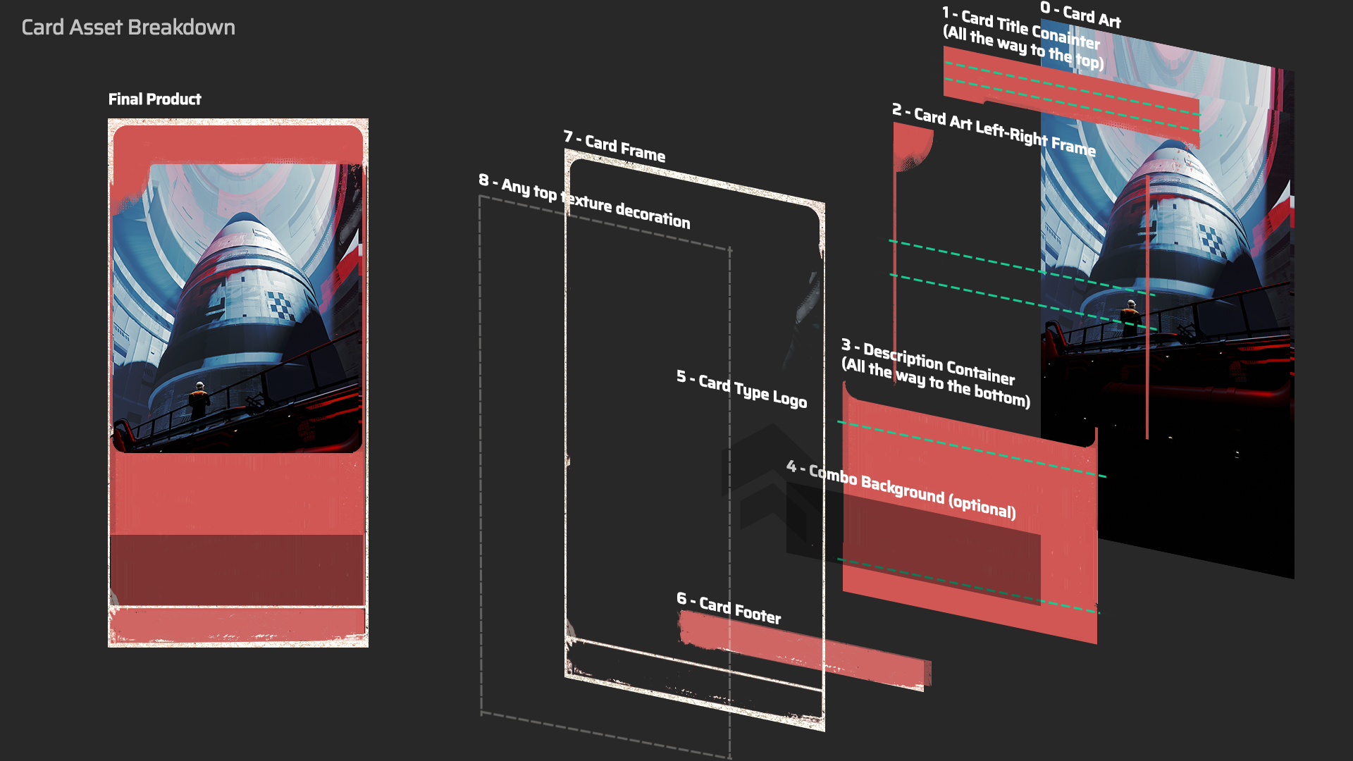
I also worked as the tech UI designer on the team to implement responsive UI visuals in the game. Here are some of the examples of my responsive 2D/3D UI implementation:
UI Assets Creation and Responsive UI Implementation:
Responsive HUD UI:
2D UI Animation and Effects:
Example - Node name banner: Instead of requesting shaders for reflection graphics, I chose to use multiple layers of 2D UI element:
3D UI Animation and Effects:
I also worked on several 3D UI animation and effects (i.e. hovering) before animator joined to tune them further.
Thank You for Reading, and…
If you have any question regarding this project, please feel free to reach out!
Awesome people I collaborated with:
Hoi-Fung Ma - Design Director
Sam Bradley - Lead UI Artist
Thomas Patterson - Gameplay / Front-end Engineer
Brooke Waddington - Technical Artist
Rob Aduna - Art Director
David Cheong - Principle Concept Artist
David Ok - Concept Artist
Brent - Audio Composer
And the entire Earthless team
.jpg)
